|
Layout 1: 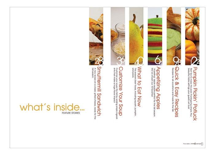 I like this layout for a table of contents because of its simplicity. The layout is not too complicated and it is easy for the consumer to find what they are looking for. There is not too much going on with the layout, but there is just enough information on the page to help guide the reader. Layout 2: 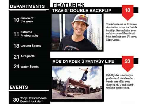 I like the layout of this table of contents because it is simple but to the point. It is easy to find each article, but it also highlights some of the most important articles in the magazine. The articles mentioned on the magazine cover could be the articles highlighted in the table of contents. Layout 3: 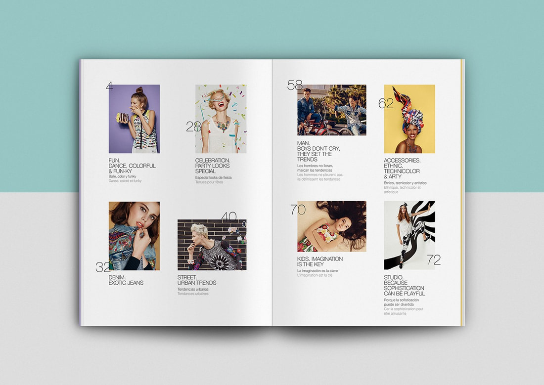 I like the layout of this table of contents because it clearly shows an image relating to each article in the magazine how to find the article the consumer is looking for. For this layout, it shows an image relating to the article, the title of the article, and a summary of the article. This could help to get the consumer interested in the magazine and influence them to read it.
For my table of contents, I would want something simple; I would want a layout that has enough information about the magazine, but I wouldn’t want to overwhelm the reader with an over-the-top design. I feel that all of these layouts fit the theme of my magazine. However, the color scheme and minor details may need to be adjusted to go with the cover. My magazine could possibly include some articles such as:
0 Comments
Leave a Reply. |
AuthorJ. Coronado Archives
April 2021
Categories |
 RSS Feed
