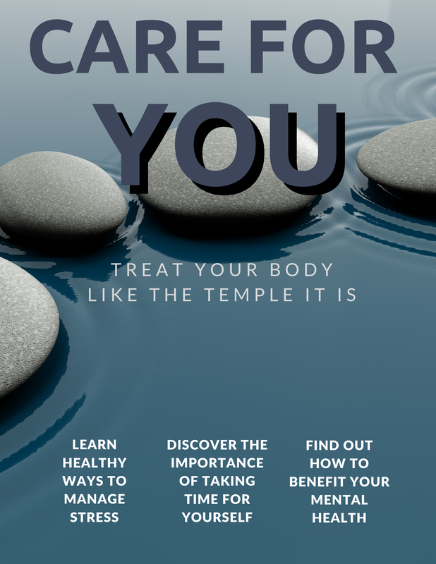
The image on the left is the first draft of my magazine cover. The image in the center is the first revision of my magazine cover. The image on the right is the final revision of my magazine cover. The first draft was the only version created with Photopea. Both of the revisions were created with Canva. The text that can be found on each cover has remained the same throughout. However, its placement changed from the first draft to the first revision.
Over the course of developing the cover, The imagery became less cluttered. It became more simple and more minimalist throughout the development process. This was to prevent the cover from feeling visually overwhelming. The color schemes of each version of the cover have been different. The first draft focuses on neutral, earthy colors, such as browns and greens. The first revision shifts away from that and features blues, pinks, and purples, with a bit of gray. The final revision features some of the blues and grays from the previous version of the cover. It also features the same rock motif that was present in the previous version. The rocks are meant to represent balance, which is an important aspect in meditation and mindfulness. Both are important aspects of self-care.
0 Comments
Leave a Reply. |
AuthorJ. Coronado Archives
April 2021
Categories |


 RSS Feed
