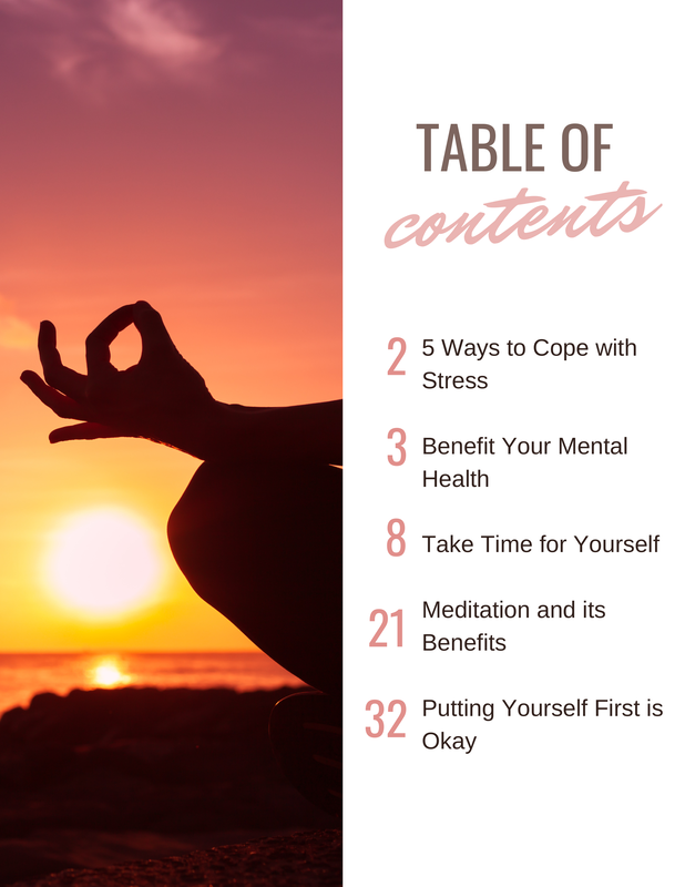
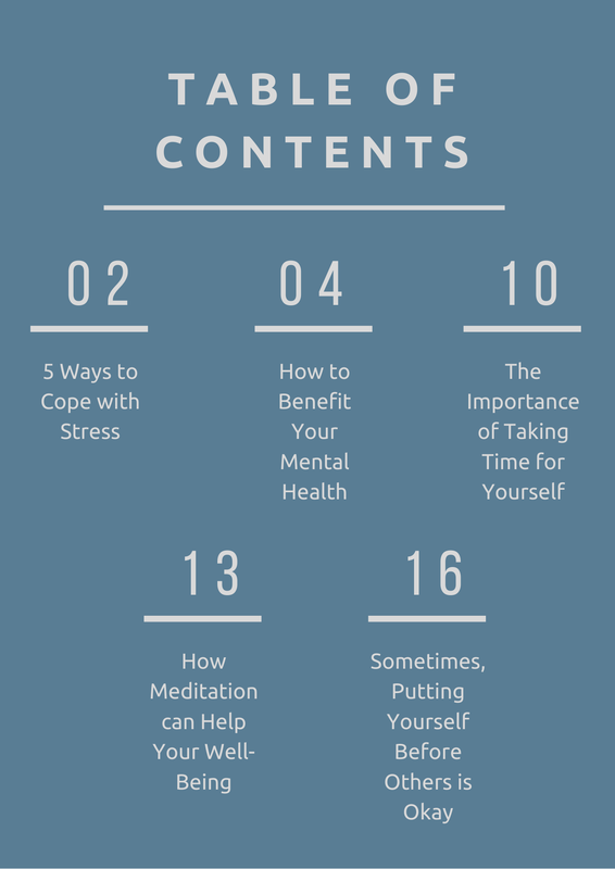
The image on the left is the first draft of my table of contents. The image in the center is the first revision of my table of contents. The image on the right is the final revision of my table of contents. Each instance of my table of contents was created in Canva. The text found within the table of contents has remained relatively the same throughout. The changes in text from the first draft to the first revision are the most notable. The title of the magazine was removed from the table of contents, as well as the summaries of each article. The images used in the first two versions of the table of contents, which were both found within Canva, are relatively similar. This contrasts with the final version of the table of contents, which does not contain an image at all, only a solid color for the background.
Changes made with the layout of the page were changed the most from the first revision to the final revision. Instead of each article being listed vertically, the listings are staggered. The page numbers of the article have also been different throughout each instance of the table of contents. As for color schemes, the first two instances are a bit similar. They both make use of imagery of a body of water. The first draft focuses more on pinks and blues while the the first revision focuses more on oranges and blacks. The final revision strays from this a bit with a minimal color scheme of blue and grey. The blue, however, is supposed to represent the water found on the magazine cover, to remain consistent with the theme of the overall magazine.
0 Comments
Leave a Reply. |
AuthorJ. Coronado Archives
April 2021
Categories |

 RSS Feed
