|
When it comes to distribution of media and communication to the public, media ownership plays and funding in contemporary media practice plays a large role. While it may seem that the origins of media come from a variety of networks, media ownership challenges this perception of diversity. A majority of companies are owned by large conglomerates, such as Disney and Viacom. Because of these conglomerates, media presented by networks owned by these conglomerates may be for the sake of journalism or information, but to cater towards what the conglomerate deems as favorable to them.
As discussed, The Walt Disney Company is one of the major media conglomerates. Because of this, they have control over the media that they own. Not only do they have control over the Walt Disney films that they have created, but they also have control over media of several other networks or companies due to Disney buying them out. For example, Disney bought Marvel, Fox, Pixar, Lucasfilm, and several other companies. Because of this, they have the ability to control production and distribution of media under their names. This means that they can choose to make certain aspects of their media as accessible or as inaccessible to the public as possible. Many of Marvel’s and Lucasfilm’s works can only be found on Disney’s streaming service, Disney+. With this limited access, the public may not have access to information that they need. Another major media conglomerate is Viacom. They own networks such as CBS, Comedy Central, Nickelodeon, MTV, and more. When a conglomerate has a large amount of power and influence in the media, they could possibly do harm to much smaller networks or independent creators. For example, Viacom is commonly known for filing copyrights strikes against creators on YouTube. Most commonly, creators on YouTube will create videos that revolve around the topic of a show owned by Viacom—such as SpongeBob SquarePants or The Fairly Odd Parents—but it will be original enough to be protected by the fair use doctrine. However, the fair use doctrine may be ignored and Viacom may decide to file a copyright strike because of the creator using unaltered clips from the show in question in their video. Filing a copyright strike removes the video from the platform and harms independent creators. With the power that the conglomerate holds, they have the ability to remove other forms of media created by independent users, which could be a form of abuse to the media industry. In conclusion, media ownership and funding in contemporary media practice could potentially be harmful to smaller or independent networks when they are being overshadowed by the major media conglomerates. These conglomerates have massive influence over the media being consumed by the public and should use their power for the benefit of its consumers, not to take advantage of them.
0 Comments
Layout 1: 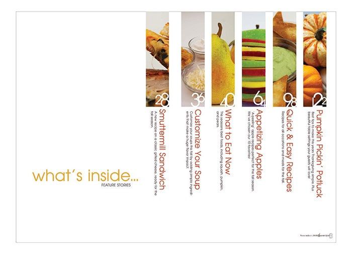 I like this layout for a table of contents because of its simplicity. The layout is not too complicated and it is easy for the consumer to find what they are looking for. There is not too much going on with the layout, but there is just enough information on the page to help guide the reader. Layout 2: 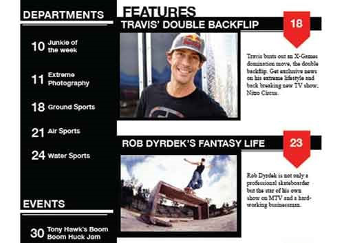 I like the layout of this table of contents because it is simple but to the point. It is easy to find each article, but it also highlights some of the most important articles in the magazine. The articles mentioned on the magazine cover could be the articles highlighted in the table of contents. Layout 3: 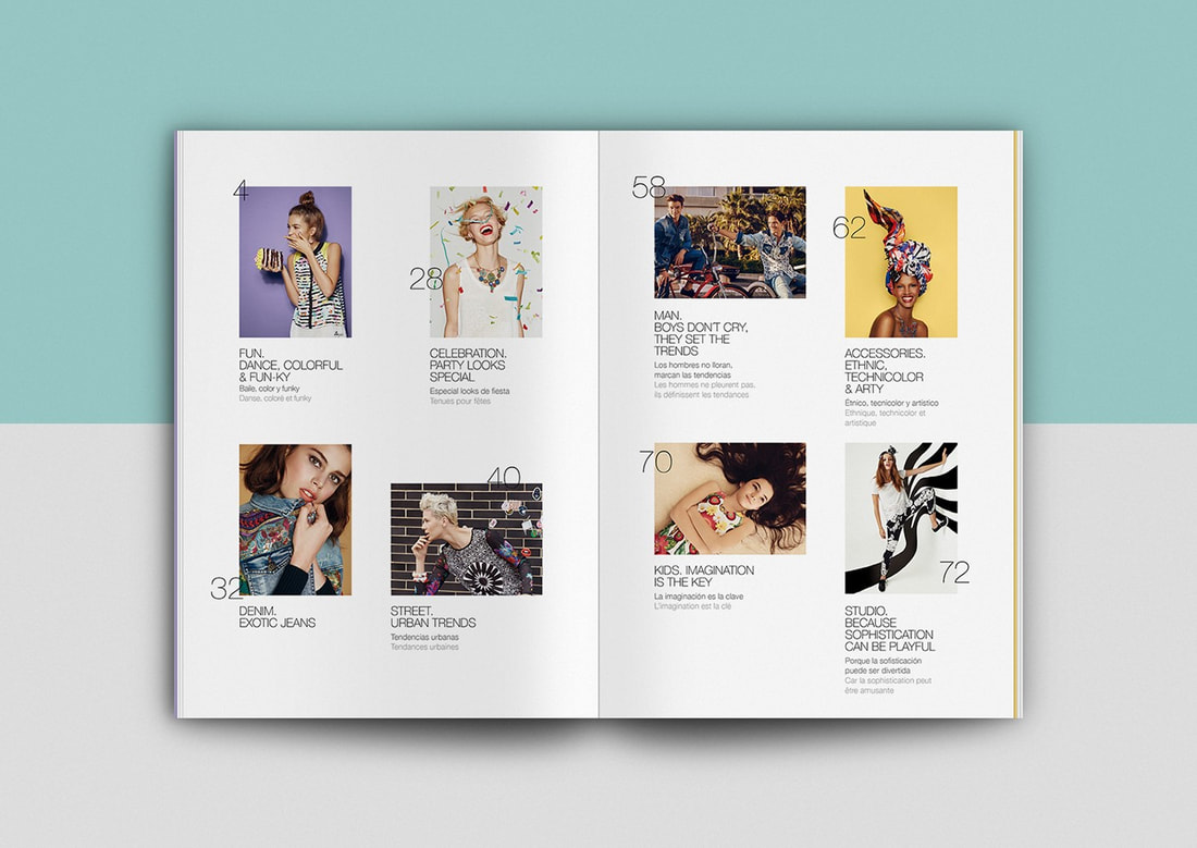 I like the layout of this table of contents because it clearly shows an image relating to each article in the magazine how to find the article the consumer is looking for. For this layout, it shows an image relating to the article, the title of the article, and a summary of the article. This could help to get the consumer interested in the magazine and influence them to read it.
For my table of contents, I would want something simple; I would want a layout that has enough information about the magazine, but I wouldn’t want to overwhelm the reader with an over-the-top design. I feel that all of these layouts fit the theme of my magazine. However, the color scheme and minor details may need to be adjusted to go with the cover. My magazine could possibly include some articles such as:
Candidate Response  My Response
Comparison
 Title/Masthead
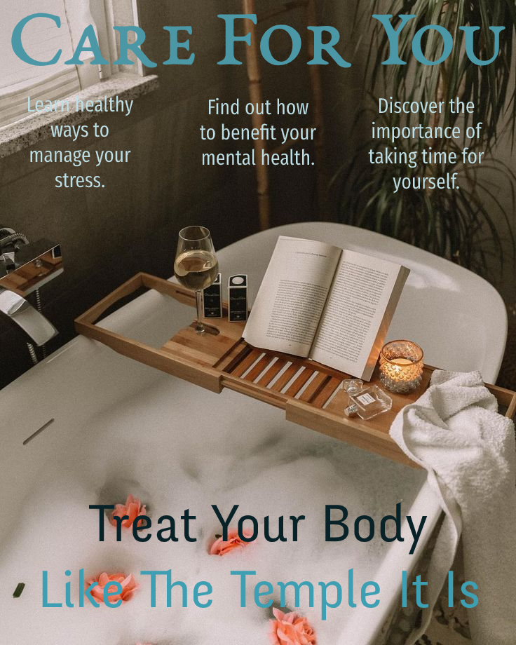
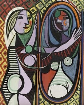
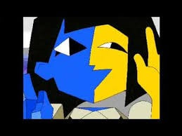
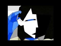
The title of this magazine, “Care For You,” could be interpreted in different ways. In one way, it could be interpreted as “care for yourself,” which would be a message to help influence consumers to practice self-care. In another way, it could be interpreted as “self-care tips for you,” which could attract consumers who practice self-care but are looking for more ways to indulge in it. Typography The fonts use throughout the magazine are smooth and curved. The lack of sharp edges is to help enforce a feeling of safety and calmness. The title, or the masthead, is the largest piece of text on the magazine. It is also the highest piece of text on the magazine. The size and the placement are intended to draw in the consumers’ attention. The second smallest piece of text and the lowest piece of text is the strapline. The strapline reads, “treat your body like the temple it is.” The size and the placement are also done to draw in the consumers’ attention. The phrase is meant to emphasize the importance of how valuable you are and how important it is to take care of yourself. The text color of the masthead and the tagline are the deepest, or most saturated, to bring the eyes of the consumer to those areas first. Image The image on the cover of the magazine is a view of a bathroom. In the bathroom is a bathtub filled with bubbles and flowers. Across the edges of the tub, a small table is being supported. On the table, there is a glass of wine, an open book, and a candle. The bathtub is shot from a high angle to replicate the perspective of the consumer; it is as if the viewer is about to step into the bathtub to relax. Bubble baths are a common form of self-care and relaxation. Lighting candles, reading books, and drinking wine are common ways to take time for yourself and indulge in self-care. The colors of the environment are muted and have earthy, neutral tones. The lack of intensity of the color palette is calming and relaxing. Language As mentioned before, the strapline is, “treat your body like the temple it is.” This strapline is meant to highlight the importance of taking care of yourself and how it is okay to indulge in self-care. The teasers closest to the masthead also add to the tagline and the magazine overall. The teasers include “learn healthy ways to manage your stress,” “find out how to benefit your mental health,” and, “discover the importance of taking time for yourself.” These teasers are supposed to grab the consumers’ attention and convince them to buy the magazine and read the articles so that they can learn more about self-care. The language is gentle and calm, which is meant to persuade the consumer that the magazine is a safe space and can help the consumer with their self-care rituals. Intertextuality is when one piece of media is referenced within another piece of media, whether directly or indirectly. There are three different types of intertextuality. Explicit intertextuality is when a piece of media is specifically alluded to with the use of a quote or reference. An example of explicit intertextuality is this image of Homer Simpson. The background, the pose, and the facial expression are all referencing Edvard Munch’s The Scream. 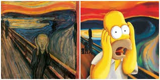 Implied intertextuality is when the allusion to other media is not as direct and similarities between the two are suggested or hinted at. An example of implied intertextuality is the character of Ena by Joel Guerra. Her design is a reference to Pablo Picasso’s Girl before a Mirror. Picasso’s painting depicts a girl looking at herself in the mirror. While the two figures in the painting are of the same person, they both contrast with one another. One side of the girl is bright and happy while the other side is dark and gloomy. The same contrast can be seen with Ena. While she is one character, she has both a happy version of herself, and a sad version of herself. The lines separating the two halves of her face are also a reference to Picasso’s Girl before a Mirror.
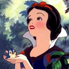
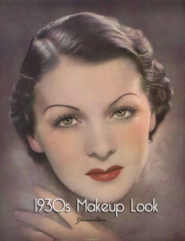
 Inferred intertextuality is when viewers or readers pieces of media to compare it to another piece of media, not necessarily something referenced by the creator intentionally. This comparison allows viewers or readers to better understand the media at hand. An example of inferred intertextuality is the comparison between a piece of media and its modern-day adaptations. For example, one might look to historical fiction to get a better understanding of what life was like back in that era of time. Although Disney’s Snow White was supposed to take place in mediaeval times, some beauty standards of the 1930s are visible in the character design, such as Snow White’s hair and makeup.
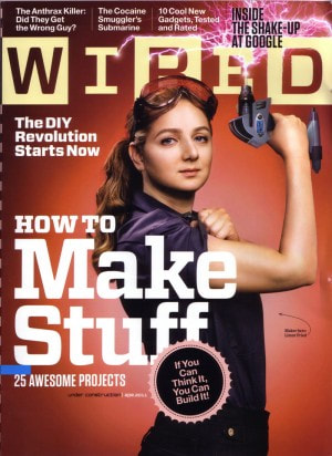
Based on this magazine cover, this issue would be appealing to those interested in crafting and building projects. This issue may have some miscellaneous articles that stand out, but a majority of the articles are about projects that readers can do on their own.
|
AuthorJ. Coronado Archives
April 2021
Categories |
 RSS Feed
