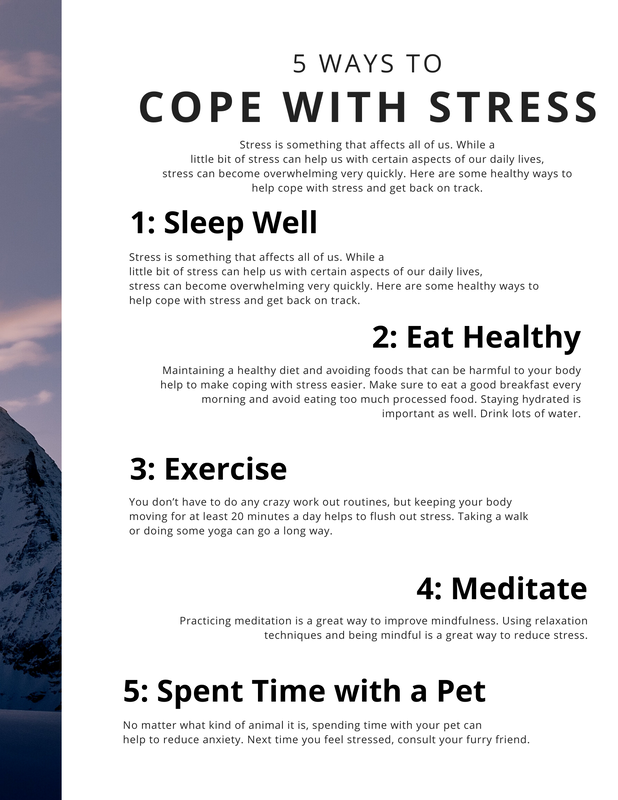
The set of images on the top is the first draft of my two-page article. The set of images on the bottom is the final revision of my two-page article. They were both made within Canva. Both versions of the article make use of a background image that is set in the outdoors. The openness of these images help to evoke feelings of quiet, peace, and tranquility. Both images were found through Canva. I thought the final image I used in the final revision fit the theme of the article better, since the person pictured is practicing meditation, one of the ways listed that can be used to help manage stress. Both versions of the article contain the same information within the text. However, the layout is different between both of them. For the first draft, The only piece of text on the left page is the title of the magazine itself. The rest of the information is on the right page. For the final revision, The title of the article is spread out across both pages, and both sections of the article itself are spread out amongst the two pages. The introductory paragraph is on the left page while the list is on the right.
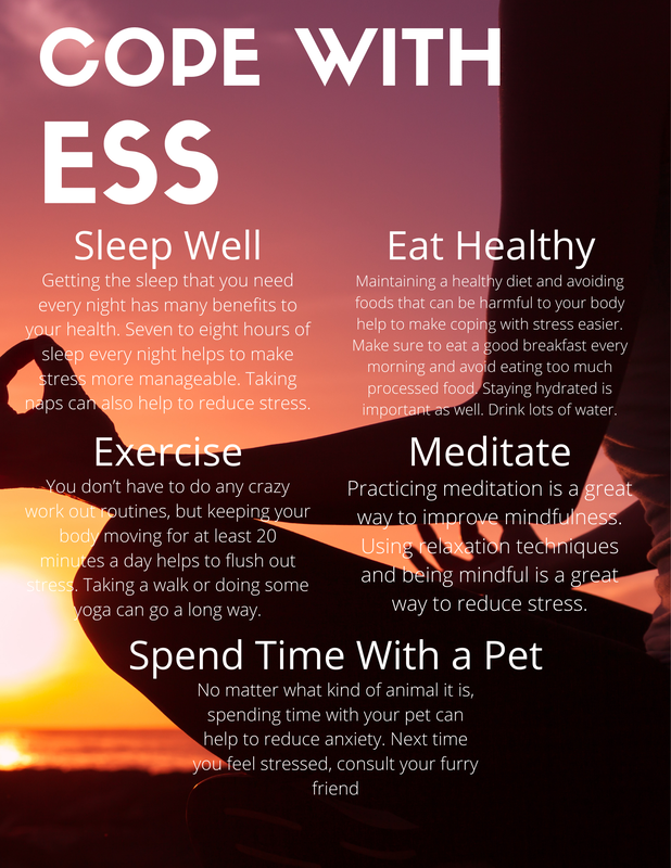
For the list section of the article, the numbers on each activity were removed to make it feel less cluttered. The text overall has been made larger to make it easier to read, especially since it is against the background image instead of a plain white page. The layout of each item on the list has also been changed. They are more evenly aligned in the final version to make it look cleaner and more organized. The list in the first draft looked scattered, making it a bit more difficult to read. The changes made make the final revision easier to read, as well as more pleasing to the eye.
This is the final revision of my two-page article. I created this by using Canva. For the title of the article, I spread it across the two pages. The background of each page was taken from one image split into two, one half per page. The image was found through Canva. The rest of the content is separated, with one element of the article per magazine. The introduction to the article is shown on the left page. It takes up a majority of the page, which helps to draw attention to it.
On the right page, the rest of the article can be found. It lists five different ways in which one can work on managing their stress. Each activity is listed as a subtitle. Since they are the largest pieces of text, besides the title of the article, they draw in the readers attention the most. Underneath each subtitle is a brief explanation of how to execute each method.
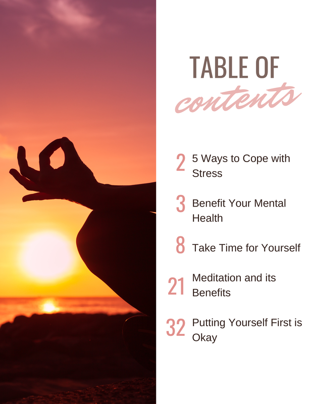
The image on the left is the first draft of my table of contents. The image in the center is the first revision of my table of contents. The image on the right is the final revision of my table of contents. Each instance of my table of contents was created in Canva. The text found within the table of contents has remained relatively the same throughout. The changes in text from the first draft to the first revision are the most notable. The title of the magazine was removed from the table of contents, as well as the summaries of each article. The images used in the first two versions of the table of contents, which were both found within Canva, are relatively similar. This contrasts with the final version of the table of contents, which does not contain an image at all, only a solid color for the background.
Changes made with the layout of the page were changed the most from the first revision to the final revision. Instead of each article being listed vertically, the listings are staggered. The page numbers of the article have also been different throughout each instance of the table of contents. As for color schemes, the first two instances are a bit similar. They both make use of imagery of a body of water. The first draft focuses more on pinks and blues while the the first revision focuses more on oranges and blacks. The final revision strays from this a bit with a minimal color scheme of blue and grey. The blue, however, is supposed to represent the water found on the magazine cover, to remain consistent with the theme of the overall magazine. 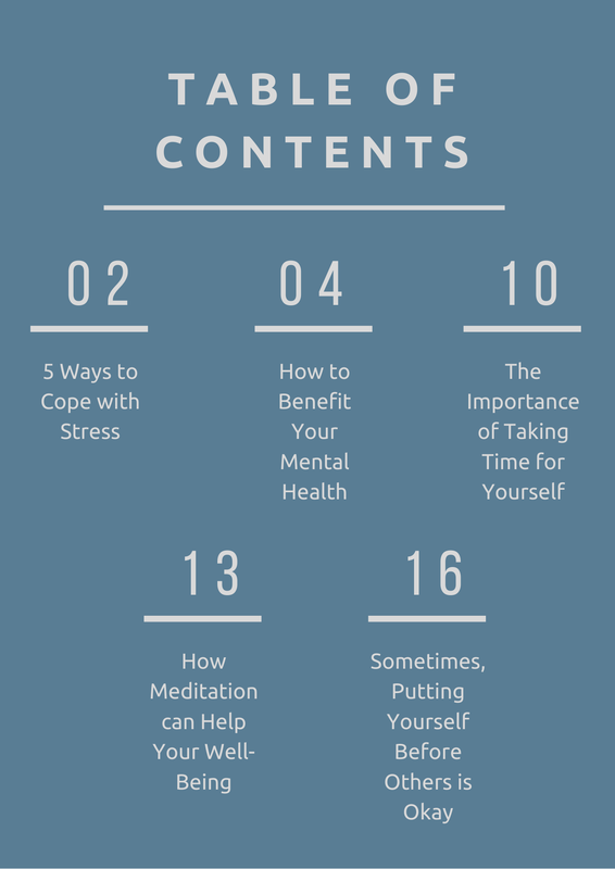 This is the final revision of my table of contents. I created this layout with the use of Canva. The overall design of this version of the table of contents is simple and very minimalistic, consisting of a color scheme of blue and grey. The simplicity of the design
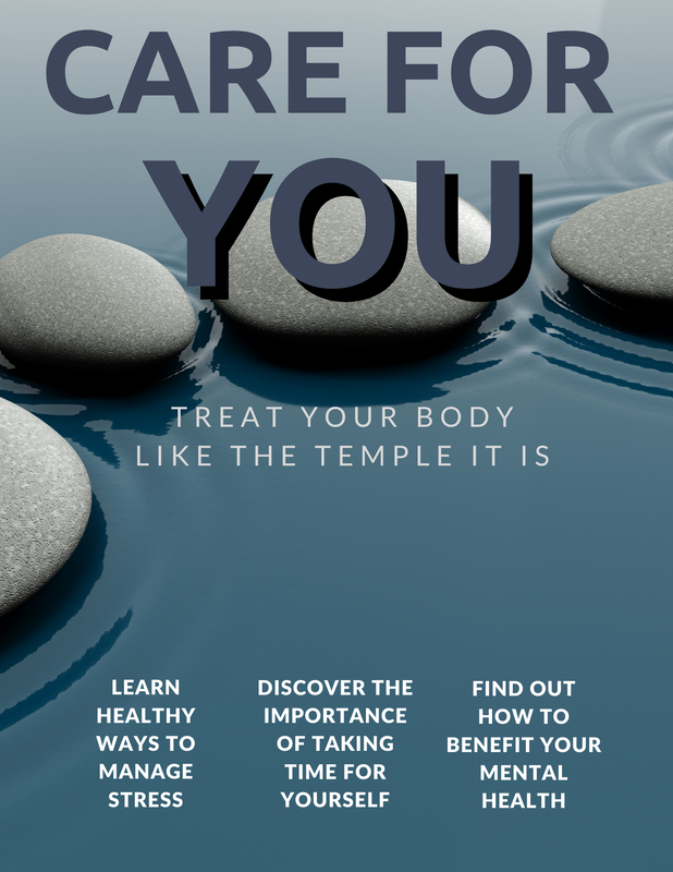
The image on the left is the first draft of my magazine cover. The image in the center is the first revision of my magazine cover. The image on the right is the final revision of my magazine cover. The first draft was the only version created with Photopea. Both of the revisions were created with Canva. The text that can be found on each cover has remained the same throughout. However, its placement changed from the first draft to the first revision.
Over the course of developing the cover, The imagery became less cluttered. It became more simple and more minimalist throughout the development process. This was to prevent the cover from feeling visually overwhelming. The color schemes of each version of the cover have been different. The first draft focuses on neutral, earthy colors, such as browns and greens. The first revision shifts away from that and features blues, pinks, and purples, with a bit of gray. The final revision features some of the blues and grays from the previous version of the cover. It also features the same rock motif that was present in the previous version. The rocks are meant to represent balance, which is an important aspect in meditation and mindfulness. Both are important aspects of self-care. |
AuthorJ. Coronado Archives
April 2021
Categories |


 RSS Feed
